I think most of you know that Seth Godin is a big favourite of ours. One of his most popular posts (albeit 5 years old) is "How to Create a Great Website". To the point and spot on.
It inspired me to write this quick blog on event websites.
It's not always easy to create a remarkable website. It's also not an easy task to create engaging and remarkable event websites. Through reading Seth's post it became clear to me what the main problems are with many event and conference websites:
Problem 1: They are ME, ME, ME, ME, ME
Problem 2: They are not thought of as a conversion tool
Problem 3: They have very cumbersome registration pages
Problem 4: They don't have a blog
Problem 5: They are not SEO friendly
Problem 6: They don't add any value and just shout attend, register, book
Problem 7: There are too many images and not enough content
Problem 8: There is too much content and not enough images
Problem 9: All the information is squashed in above the fold
Problem 10: They end up being digital versions of the brochure. Much like the brochures - with too much information
Problem 11: They're not easy to navigate
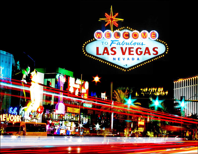
Problem 12: They look like Las Vegas boulevard, everything's fighting for attention!
Seth puts it so well.
Less. Fewer words, fewer pages, less fine print.
Insight is good, clever is bad. Many websites say, “look at me.” Your goal ought to be to say, “here’s what you were looking for.”
In line of that here is our take on what we think are good event website designs.


Do you have any comments?