Some time ago we wrote a post looking at the main problems with conference and event websites. We shared our views on what we think is wrong with many of them, as event websites, especially conference websites are particularly lacking inspiration.
Turns out this topic is close to your hearts!
So we thought it would make sense to turn the negative into a positive and share with you what we think are in fact good event websites. The below examples have been picked because they are simple, easy to navigate, have good design, use images and copy well.
We hope this helps to gain some inspiration if not perspective on how others have approached their event website designs. By no means is this is a definitive list (hence the title NON-definitive) and we envisage this post will continue to be updated as we come across more inspiring websites. We'd love to hear your contributions too! The idea is you click on each of the images and explore the event websites for yourselves to get a good feel of the design, navigation and event information provided.

Let's start with some of the more traditional examples
These are good examples of creating a strong website within a standard template - which sometimes event marketers have to adhere to. If your organisation produces more than 20 events a year, then it can make financial sense to use standardised templates for the whole organisation. This is common practice within large organisations and can sometimes present an obstacle for marketers and designers alike in creating something fresh and engaging.
Big events such as expos, congresses and trade shows, can also present a challenge as there is usually lots of information to provide. Sometimes they combine a conference, exhibition and awards elements. These following examples have a done a good job of keeping design and delivery strong within a standard template.
IAML Roma
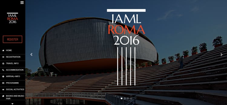
A classic, straighforward and well organised website, created using Khore theme from Showthemes. All the information is within the main menu on the left, with the homepage showcasing the beautiful pictures of Rome without any distractions.
International Food & Drink Event
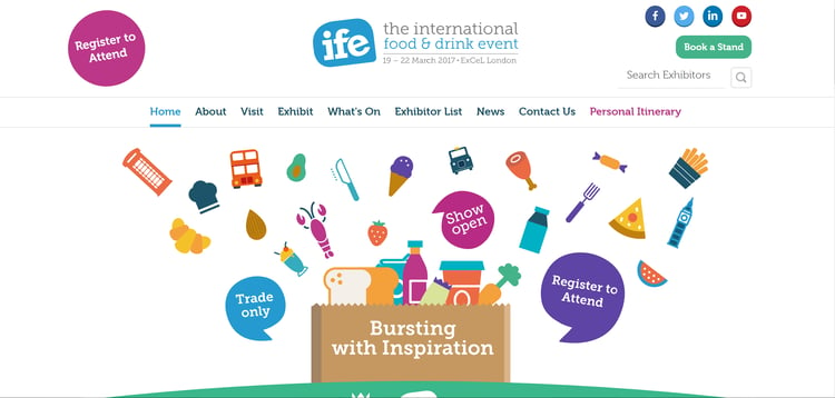
This event from the Montgomery shows is a very good example of how a template can be made to look visually good and fairly clean.
Outlook Festival
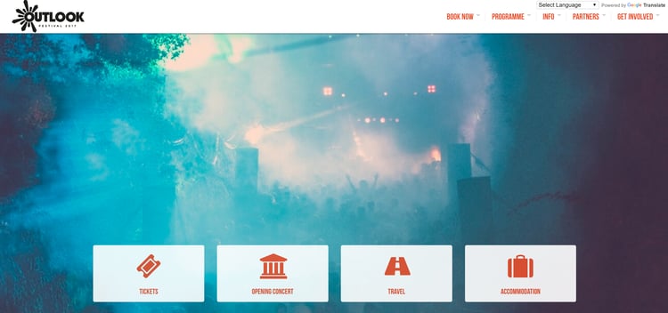
This website stands out by its visual presentation and clarity. The full-screen photos on a slider are a great way to showcase the main highlights and locations of the event, while the icons at the bottom of the screen give you a shortcut to the most important information and tickets.
Supply Chain & Logistics Summit & Expo
A very simple website by Mira Media where you can easily find everything you need to know about the event. Highlighting the speakers right at the top, it gives you more details below the fold.
TM Forum Live
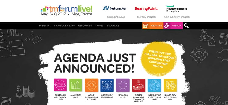
This website by Intuitive Design has a great way of showing the main highlights and stats of the event, speakers and agenda points, which are graphically presented within the slider.
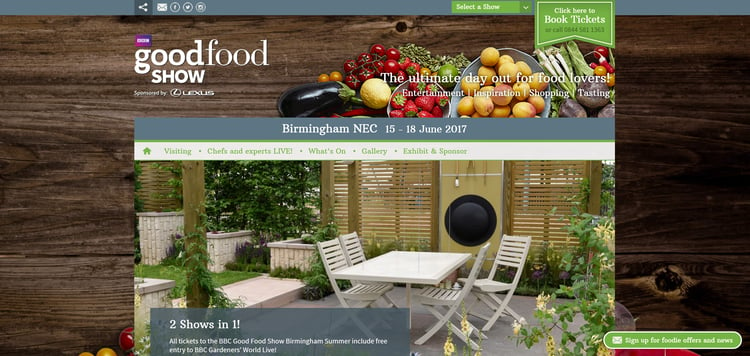
The Good Food Show
We like the way they use the backgrounds, highlight the sliders and the user journey is very easy to figure out. They also have clear call to actions not only for those interested in attending but also for those looking for something else.
Now moving onto designs that go beyond the events norm...
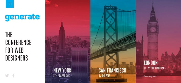
Generate Conference for Web Designers
This website is exceptionally well designed, in keeping with the contents of the events. Very visual and clutter free. The page is divided into two parts, one of which is static and the other one scrolls down to present the three events and their main highlights, videos, photos, testimonials and sponsors. More detailed information is well organised in the main menu.
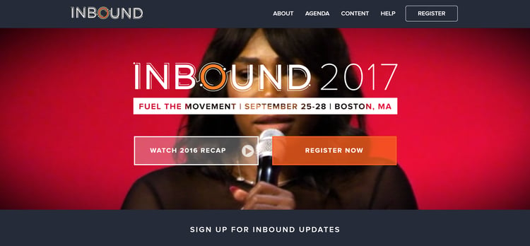
Inbound Conference
This is HubSpot's event, gathering marketers from all over the world to talk about inbound marketing. In our opinion they are one of the best at content and inbound marketing, and we wanted to see how the best in the marketing industry go about marketing their events.
This site is very, very simple. They've created a microsite which just focuses on the main goal of converting visitors to delegates and nothing else.
Hubspot add big value through their blogs, which in our opinion is one of the best in the marketing industry but interestingly they have not hosted the blog on this event website page.
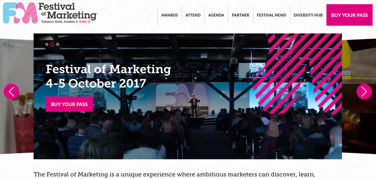
Festival of Marketing
This website by ASP is a good example of a very informative, yet clear and easy to navigate event page. One of the best features here is the slider that shows you three main highlights and gives you clear calls to action. Lots of useful information below the fold too, very clearly presented.
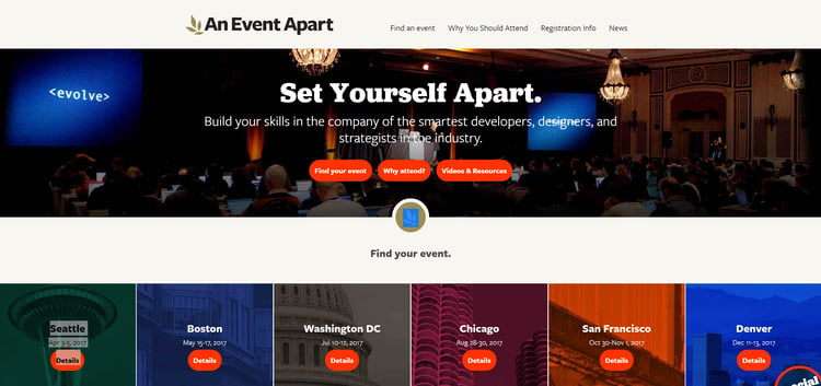
An Event Apart
A conference that is made of a series of multi-located event. They have a "news" section offering additional insight about their speakers and key people involved. Very clean and simple.
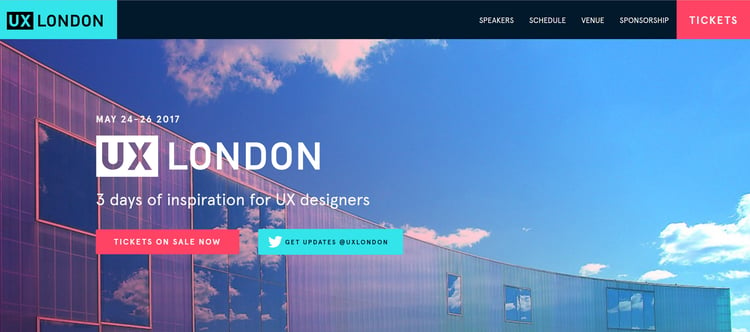
User Experience London
A very clean design with an interesting approach with two columns, one of which slides and the other just changes accordingly. The main selling poins are testimonials and the speakers - they each have a detailed page for their bios and stories. We really like how they share the programme on the schedule page - easy to navigate and clutter free.
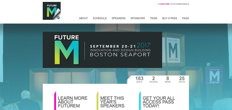
Future M
The site is easy to navigate and provides a very clear path for what they want you to do next. The countdown tab is integrated nicely.
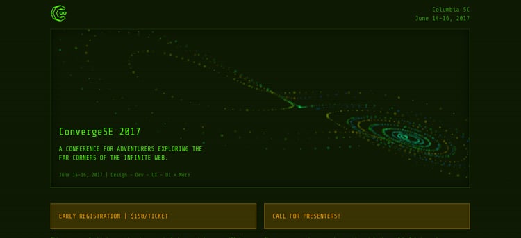
Converge
Simplicity at its best.
Now what is your take on good event website design?
There is no coincidence that most of the good event website design examples here presented are promoting events of a technological/marketing background, appealing to one of the most difficult target markets there are - us marketers, designers and developers. But this perfectly demonsrates that this same approach could be used sector-wide. Why can't finance, oil and gas, manufacturing etc events all benefit from great design.
We want to add as many designs to this post as possible. So if you feel there is a website that we should be listing here, please send it through to us, writing a couple of lines on why you think it's a good event website design and we'll review it with the view to publishing it. 




Do you have any comments?