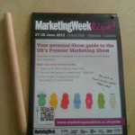
I received the Marketing Week Live! mailer through my letterbox this morning – 2 weeks before the big event. I can’t recall if I’ve received any prior to this, but this one grabbed my attention. I’m sure many of you have received the same mailing – final campaign efforts are kicking in to ensure pre-registrations are hitting target.
I really like their choice of mailer – it’s a handy sized design (pen sized in fact!) and miraculously it contains all the information a traditional exhibition booklet would have with the added bonus of a pierced hole so you can hang this all important event guide from your shower curtain! (or something like that! Please tell me why I’m missing the point with that.) My only negative if you like, is I’m not too hot on the ‘jelly babies’ branding – each to their own.
If you are looking to do something a little different with your direct mail campaign, then downsizing the piece like these guys have done, can really have impact. Just don’t be afraid to test.
Apparently From…
The Green Jelly Baby!


Do you have any comments?